cory schooll&nd
Design


Evolv Brand Application
Client
Evolv
Contribution
Brainstorming, iterative design & ordering
Description
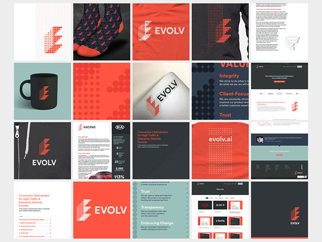
It’s always exciting to take a brand in its infant stage and nurture it towards maturity. Given a logo and color palette, I was able to quickly re-brand existing materials, design new collateral, and determine the look and feel of Evolv as encountered by employees, prospects, and more.
Case Study Template & Product 1-Pager
Client
Evolv > Product Marketing
Contribution
Template, layout & iconography
Description
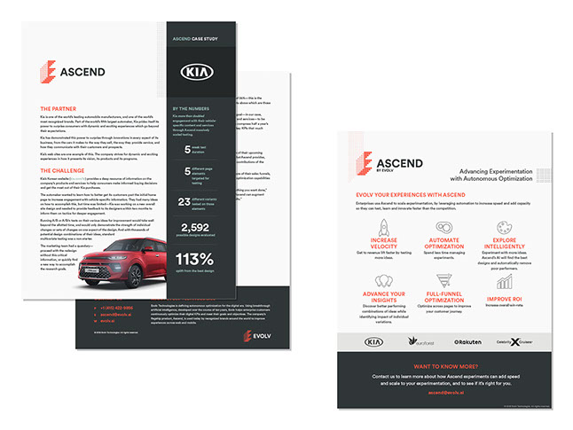
When Sentient Ascend was re-branded as Ascend by Evolv, all our collateral needed a makeover. All current case studies were re-skinned, and some content pieces were re-built from scratch. Once the new branding was finalized, I was able to create new templates and apply it to all 20 case studies, white papers, and other collateral in a matter of days.
Many of these documents were translated into German or Korean, and I managed those layouts as well.
White Paper
Client
Evolv > Marketing
Contribution
Template, layout, brainstorming & graphics
Description
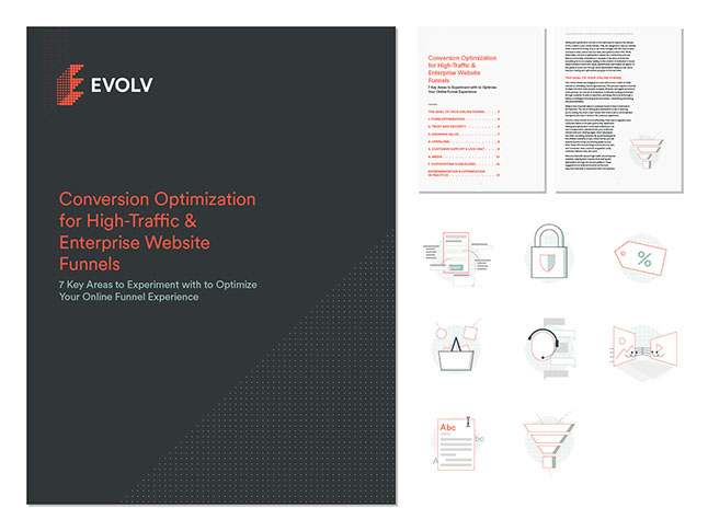
I designed this ebook template to work as well on screen as in print. The green dots lead the reader past the title page to the hyperlinked contents, and are echoed in each of the custom illustrations.
Print Identity
Client
Evolv
Contribution
Brainstorming, iterative design & ordering
Description
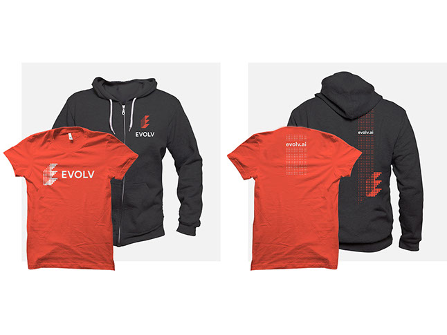
As a young brand, Evolv needed to be as visible as possible at upcoming trade shows. (They also wanted practical, comfortable wear for their employees.) I designed these shirts (available in two colors) and hoodies to visually complement each other and showcase the brand inside and outside the office.
In addition to apparel, I also designed presentation templates, corporate letterhead, folders, greeting cards, stickers, mugs, notepads, mugs, and pens.
Brand Style Guide
Client
RichRelevance > Content Creators
Contribution
Copy writing, page layout & design
Description
The old brand style guide was a Word document that was long and not terribly attractive, so I decided to update it with the company’s latest branding and market positioning. I also wanted to make the entire package more presentable in the hopes that employees could use it to unify the company’s brand across disparate channels.
Print Identity
Client
RichRelevance
Contribution
Design
Description
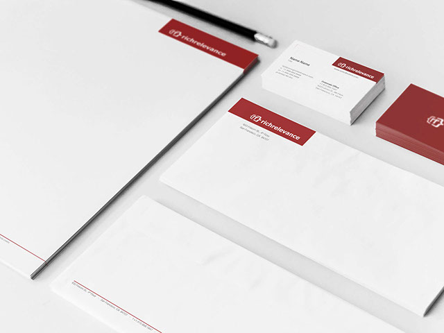
I was responsible for continually evolving RichRelevance's brand identity. Here is a sampling of letterhead stationery and business cards used by RichRelevance employees.
Product 1-Pagers
Client
RichRelevance > Product Marketing & Sales
Contribution
Template, layout & graphics
Description
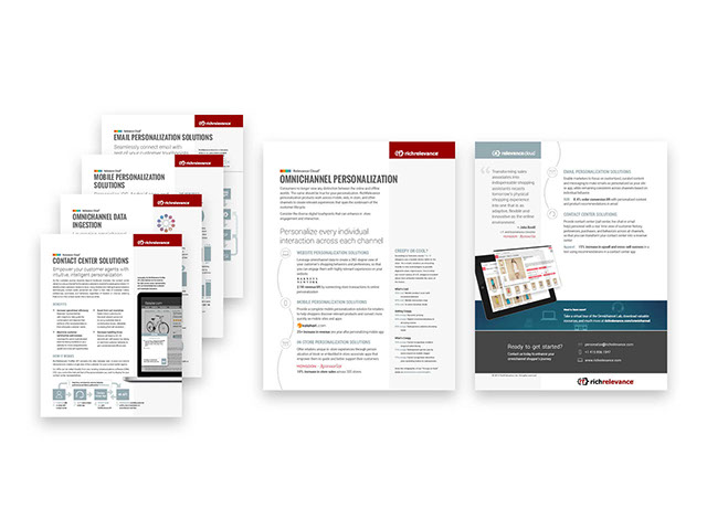
RichRelevance’s primary product collateral was written by the Product Marketing team, then handed over to me for layout. With multiple copy writers, one challenge was making the content consistent across all documents—in structure and voice as well as presentation in general.
The end result was a body of literature that is well-organized and stylistically consistent—both internally as well as externally with the website and other marketing materials.
Most of these were translated into French, German, and Portuguese.
Solution 1-Pagers
Client
RichRelevance > Product Marketing & Sales
Contribution
Template, layout & graphics
Description
RichRelevance’s primary product collateral was written by the Product Marketing team, then handed over to me for layout. With multiple copy writers, one challenge was making the content consistent across all documents—in structure and voice as well as presentation in general.
The end result was a body of literature that is well-organized and stylistically consistent—both internally as well as externally with the website and other marketing materials.
Most of these were translated into French, German, and Portuguese.
<
>


Corporate Home Page
Client
Evolv
Contribution
Design & Wordpress management
Description
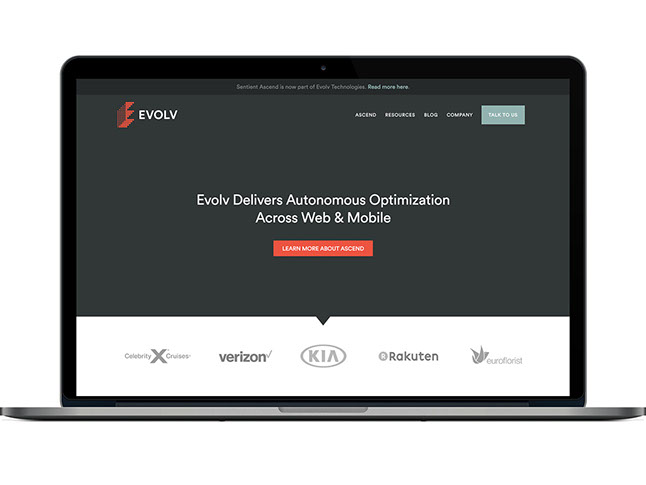
The initial Evolv Technologies home page was designed to bridge messaging for a fledgling company with that of an established product. The main goal was to drive traffic to the product page. Client logos above-the-fold lent credibility.
Product Page
Client
Sentient > Product Marketing
Contribution
Brainstorming, iterative design & Wordpress management
Description
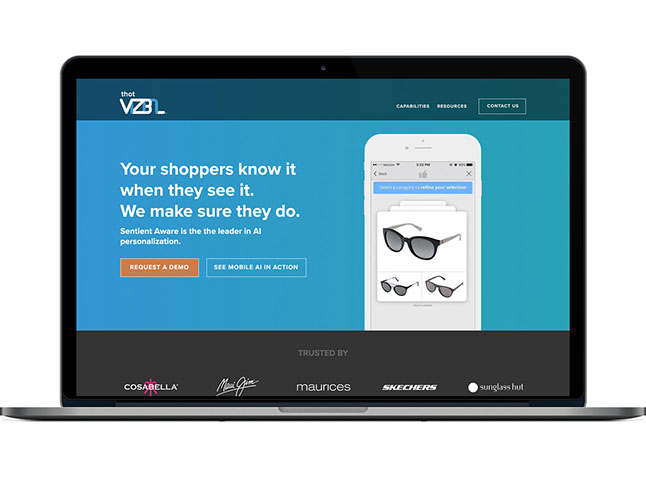
Product Marketing’s primary objective was to boost demo requests while showcasing the product in action. Fresh copy and a striking call to action accomplished the former, while a video link and HTML5 embedded video helped with the latter.
Click here to see the full page. (Originally designed for Sentient Aware, I white-labeled this page for use on this site.)
Responsive Site Design:
Home Page
Client
RichRelevance > Marketing
Contribution
Brainstorming, iterative design
Description
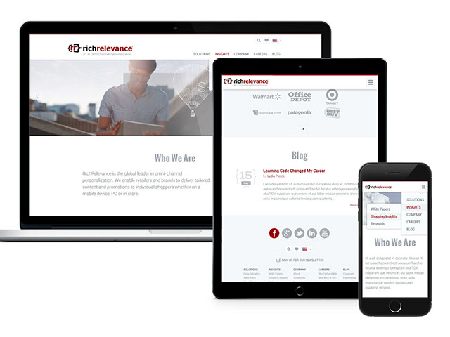
These are Photoshop mock-ups of the new homepage of RichRelevance's corporate website from the 2013 redesign, showing how the different content would be displayed across different device types.
While the overarching goals of the redesign were to add functionality while looking good and increasing conversions, the primary goals for this page were to better communicate what RichRelevance does at a high level and make key content readily accessible.
Responsive Site Design:
Insights Page
Client
RichRelevance > Marketing
Contribution
Brainstorming, iterative design
Description
This "Insights" page was one of the biggest improvements made to the site in terms of content. Essentially a one-stop shop for all forms of thought leadership and case studies, I worked closely with a contract web developer to bring my vision of this interactive page of filterable content to life.
"Switch" Email Campaign
Client
RichRelevance > Product Marketing
Contribution
Template, layout, brainstorming & graphics
Description
Hand-coded HTML email sent to prospects. The header copy hints at RichRelevance competitors' inability to provide truly personalized product recommendations, instead of "black box" messaging that performs poorly by comparison.
Innovation/Platform White Paper Email Campaign
Client
RichRelevance > Product Marketing
Contribution
Template, layout, brainstorming & graphics
Description
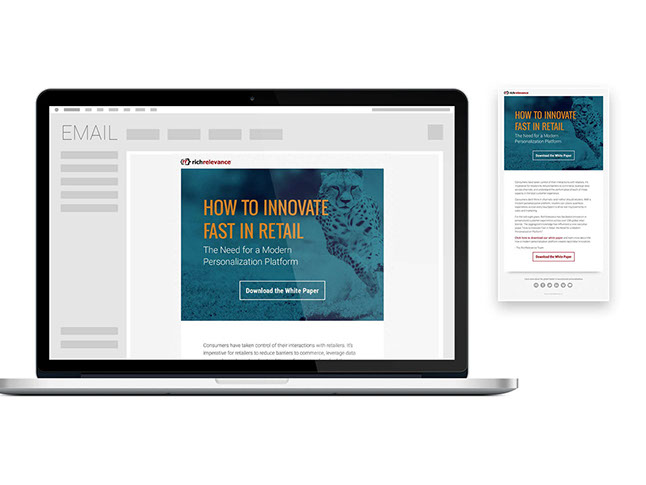
Hand-coded HTML email to promote a new white paper. This email was translated for five regions.
<
>

Corporate Ad
Client
Sentient > Product Marketing
Contribution
Brainstorming, iterative design
Description
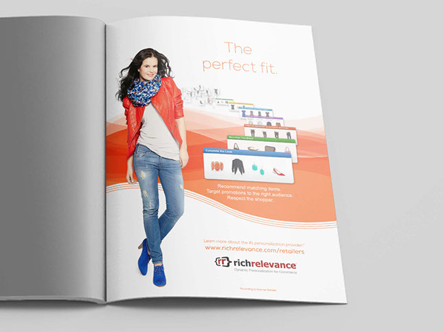
This full-page ad ran in the program for a major ecommerce trade show. In a booklet filled with pages of the same retail imagery, we wanted to be an aspirational breath of fresh air.
Trade Show Booth
Client
Evolv > Product Marketing
Contribution
Brainstorming, iterative design & ordering
Description
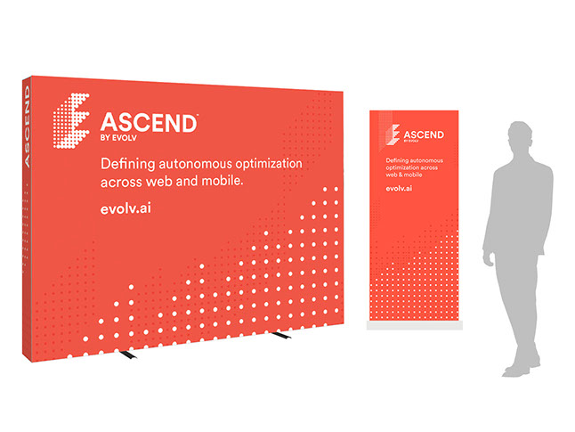
As a young brand, Evolv needed to be as visible as possible at upcoming trade shows. Earlier iterations featured a dark gray background. While easier to read, we decided to go with the far bolder red color to draw more attention to the booth, where a sales representative could take over.
Trade Show Booth
Client
Sentient > Product Marketing
Contribution
Brainstorming & iterative design
Description
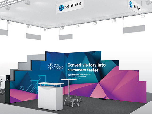
This is the display I designed for Sentient’s booth at DMEXCO, a large digital marketing conference in Cologne.
Corporate Ad
Client
RichRelevance > Marketing & Sales
Contribution
Brainstorming, design & execution
Description
This is a representative print ad that was published in a Women’s Wear Daily event catalog. The goal of this ad was to communicate what RichRelevance technology does at a high level, while incorporating some of our core messaging for an audience that might be unfamiliar with us.
Trade Show Booth
Client
RichRelevance > Marketing
Contribution
Consultation, mock-ups & design
Description
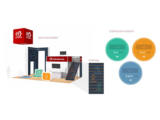
The Shop.org Annual Summit is the largest trade show in the ecommerce industry, and RichRelevance always boasts a strong presence.
For six years, I worked closely with the CMO and event planner to craft booths of various shapes and sizes.
The 2015 booth, shown here, measured 20x30 feet and included multimedia demos, an upstairs meeting space, and a large, internally lit, hanging logo sign.
Trade Show Floor Tiles
Client
RichRelevance > Marketing
Contribution
Consultation, mock-ups & design
Description
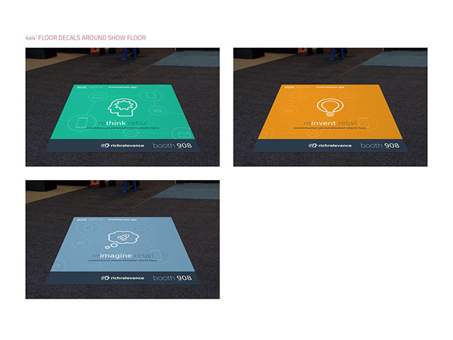
The Shop.org Annual Summit is the largest trade show in the ecommerce industry, and RichRelevance always boasts a strong presence.
For six years, I worked closely with the CMO and event planner to craft booths of various shapes and sizes.
Each year we also sponsored the large floor tiles peppering the entire show floor, guiding more traffic to the RichRelevance booth.
Customer Advisory Summit
Client
RichRelevance > Marketing
Contribution
Brainstorming & design
Description
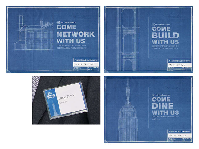
Each year, RichRelevance would host a customer advisory summit, inviting clients to learn from each other and gain insights into the product roadmap.
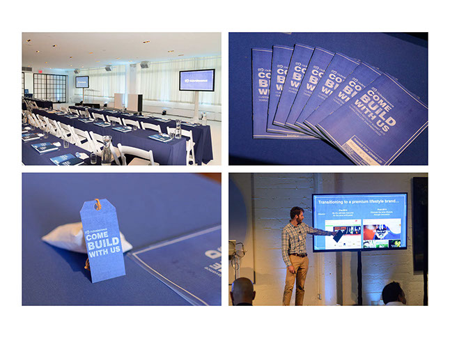
The theme for this year's summits was "Come Build with Us," and featured notable landmarks from the UK, San Francisco, and New York, where the summits were held. This image shows some of the signage from the show, along with a name badge.
Customer Advisory Summit
Client
RichRelevance > Marketing
Contribution
Brainstorming & design
Description
This image shows some of the additional branded elements of the events, including notebooks, program booklets, Lego sachets, and PowerPoint template.
Recruiting Ad Campaign
Client
RichRelevance
Contribution
Brainstorming, design & execution
Description
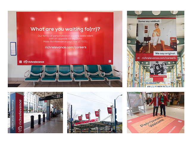
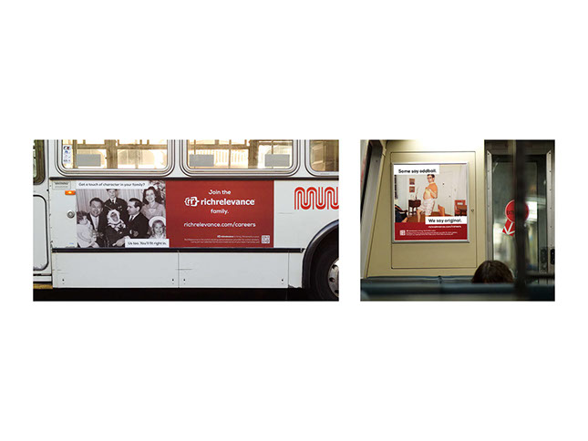
In 2013, RichRelevance decided to launch an ad campaign geared at attracting talent from all over the Bay Area. For a time, a variety of “family”-oriented ads were prominently visible at the downtown CalTrain station, BART trains, MUNI buses, an electronic billboard, and even a Pandora radio spot.
I was responsible for brainstorming, collaborating, and presenting ideas for the campaign, and ultimately for every final deliverable for the visual ads.
<
>


Corporate Values Posters
Client
Evolv
Contribution
Brainstorming, iterative design & ordering
Description
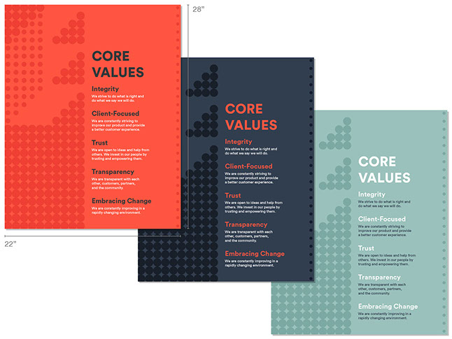
Evolv requested posters communicating their new corporate values, in three different design or color schemes. I created this design that evokes the company “E” icon as a design motif, and together incorporates all five primary corporate colors. The posters were rotated with each other every few months to keep things fresh.
Anniversary Wine Labels
Client
RichRelevance > HR
Contribution
Brainstorming & design
Description
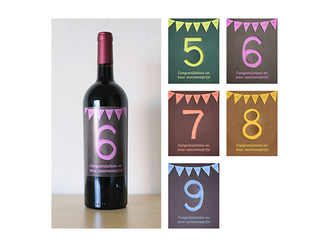
I think few designers would pass up an opportunity to design a wine label. It’s a task where really anything is possible.
The challenge here was to come up with a satisfactory design on an incredibly tight deadline—two days. I hopped to it, making a handful of sketches, discussing them with HR, and moving forward with our favorite idea. We decided to make the employment anniversary year the focus of the design.
Sometimes I mimic paper art entirely digitally, but this time I wanted to use the real thing. So about two thirds of my time was spent planning, cutting, arranging, lighting, and shooting the numbers and pennant garland, and the rest was spent finalizing the layout, colors, and preparing for print.
Holiday Party Theme
Client
Sentient > HR
Contribution
Brainstorming & iterative design
Description
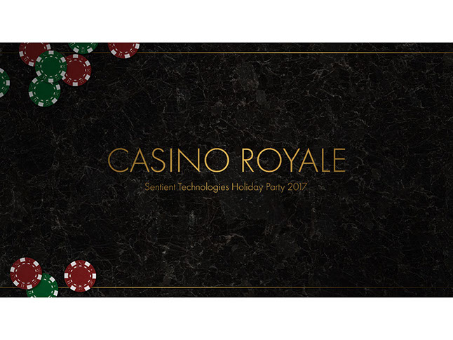
HR chose “Casino Royale” for the theme of Sentient’s biggest and swankiest holiday party. In branding it, my aim was to combine holiday colors of red, green, and gold with mid-century typography and Bond-level class.
Holiday Party Theme
Client
Sentient > HR
Contribution
Brainstorming & iterative design
Description
What do you do when a company wants to throw an ugly-sweater-themed holiday party at a Mexican restaurant known for their margaritas? The problem is the solution. I combined margarita and corporate symbols with traditional woven sweater patterns to create the branding for the party’s signage and slideshow template.
Holiday e-Card
Client
Sentient > Marketing
Contribution
Brainstorming & imitative design
Description
The upper half is primarily stock, but I had to make it look like the Sentient icon belonged, including the appearance of folds and shadows.
<
>

Mobile Shopping Trends
Client
RichRelevance > Marketing & Sales
Contribution
Brainstorming, analytics, design & execution
Description
For this infographic, I worked very closely with the Analytics team to sort through all the available data and decide which trends were the most interesting.
Two versions of this infographic—using either US and UK data sets—were produced, and I enjoyed that the diversity of data collected allowed me to communicate the findings in a wide variety of ways.
In-Store Personalization
Client
RichRelevance > Marketing
Contribution
Brainstorming, analytics, design & execution
Description
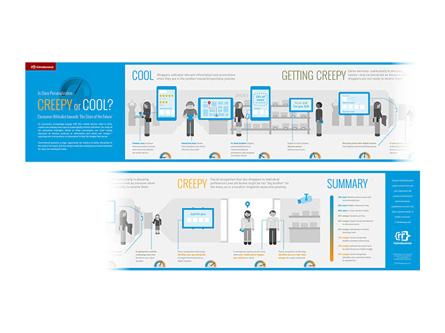
RichRelevance conducted a survey to gauge people’s reactions to in-store personalization technologies. We then sorted the technologies based on how “creepy” and “cool” the respondents rated them. A major challenge of this project was to keep the “creepiness” to a minimum, and present all technologies at face-value.
I decided on horizontal approach to convey the information, using a store interior to help guide the reader along from the cool technologies to the creepier ones. When I uploaded the final graphic to the website, I added some extra javascript to the page to allow for horizontal scrolling of the graphic with a mouse or trackpad. A four-page PDF was also available for download or printing.
This project was translated into French, German, and Portuguese.
In-Store Personalization
Client
Sentient > Product Marketing
Contribution
Brainstorming & iterative design
Description
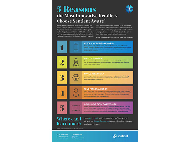
This isn’t really an infographic, but more of an informational 1-sheet for digital distribution. It highlights some of the key features of the product in a visually engaging way.
<
>




White Paper
Client
Evolv > Marketing
Contribution
Template, layout, brainstorming & graphics
Description
I designed this ebook template to work as well on screen as in print. The green dots lead the reader past the title page to the hyperlinked contents, and are echoed in each of the custom illustrations.
Case Study Template & Product 1-Pager
Client
Evolv > Product Marketing
Contribution
Template, layout & iconography
Description
When Sentient Ascend was re-branded as Ascend by Evolv, all our collateral needed a makeover. All current case studies were re-skinned, and some content pieces were re-built from scratch. Once the new branding was finalized, I was able to create new templates and apply it to all 20 case studies, white papers, and other collateral in a matter of days.
Many of these documents were translated into German or Korean, and I managed those layouts as well.
Innovation/Platform White Paper
Client
RichRelevance > Product Marketing
Contribution
Template, layout, brainstorming & graphics
Description
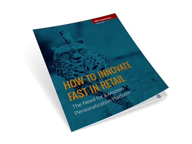
This ambitious white paper aimed to educate the reader on modern consumers and technology layers, the many different kinds of data that should be used for omnichannel personalization, and why RichRelevance is the only true personalization platform solving for these new realities.
Focusing on the concept of “speed,” I chose a captivating photo of a cheetah for the cover, and formed a color palette with turquoise as the key color.
Innovation/Platform White Paper
Client
RichRelevance > Product Marketing
Contribution
Template, layout, brainstorming & graphics
Description
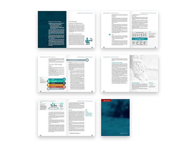
Here are some of the page spreads from the white paper. I implemented translations for this 20-page, 6,000-word document for French, German, and Portuguese.
Innovation/Platform White Paper Email Campaign
Client
RichRelevance > Product Marketing
Contribution
Template, layout, brainstorming & graphics
Description
This is the HTML email hand-coded to promote the white paper. The email was also translated for five regions.
CMS White Paper
Client
RichRelevance > Product Marketing
Contribution
Template, layout, brainstorming & graphics
Description
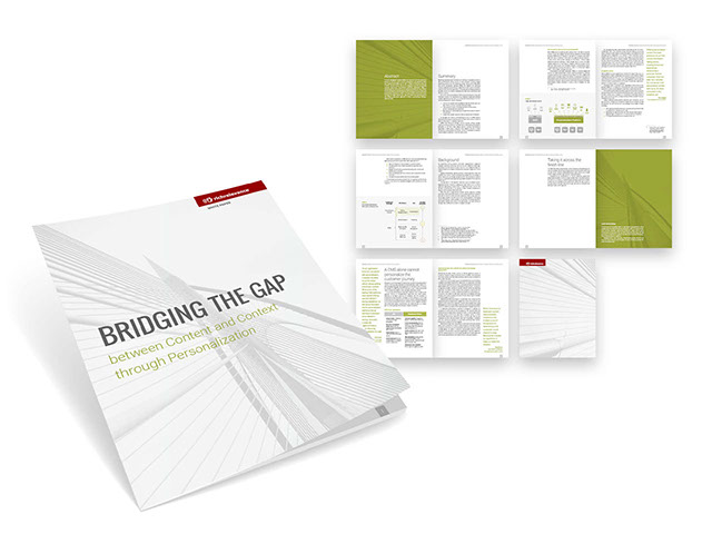
This white paper is a good example of the type of "clean" design I excel at. The document makes good use of the template I created, and the limited color palette helps unify the assortment of custom graphics.
Studio Video Recording Guide
Client
RichRelevance > Any internal video content creators
Contribution
Start-to-finish conceptualization, technical copy writing, asset creation, and design
Description
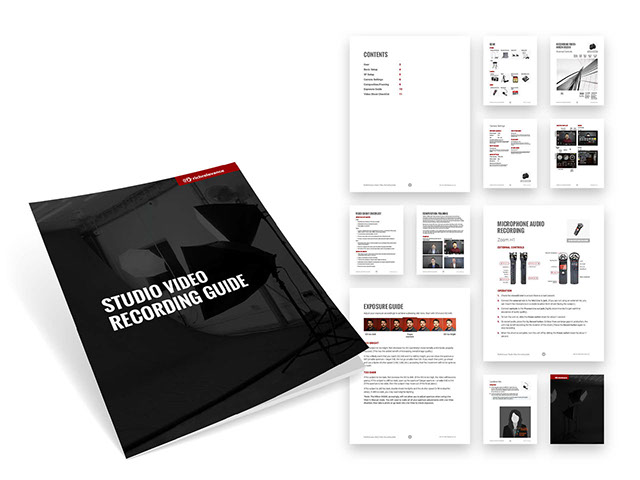
The Creative Team sought to document how it shot video footage to assist video content creators in other departments—primarily so that the resulting footage would be usable and reflect best practices, but also for stylistic consistency.
These pages reflect only a sampling of the full document.
Relevance 2.0 Kickoff
Client
RichRelevance > Client Services
Contribution
Copy editing, page layout, custom graphics, and design
Description
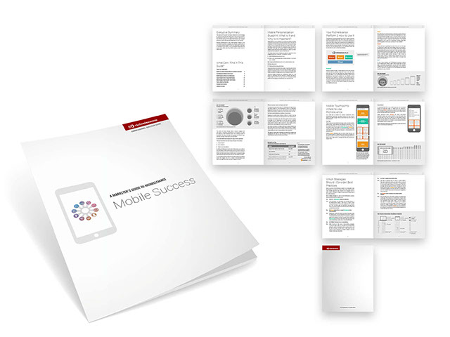
This 4,500-word document was the first in a series of documents designed to help our clients get the most out of their implementation by communicating a wealth of general and specific tips and principles. Each guide was focused on a particular channel—in this case, mobile.
My main goals for this project were to first create a solid layout template for the document series, to make the rather technical content as approachable and digestible as possible, and to make the final PDF user-friendly and interactive.
Brand Style Guide
Client
RichRelevance > Content Creators
Contribution
Copy writing, page layout & design
Description
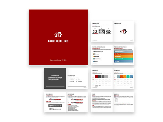
The old brand style guide was a Word document that was long and not terribly attractive, so I decided to update it with the company’s latest branding and market positioning. I also wanted to make the entire package more presentable in the hopes that employees would actually use it, helping to unify the company’s brand across disparate channels.
Product 1-Pagers
Client
RichRelevance > Product Marketing & Sales
Contribution
Template, layout & graphics
Description
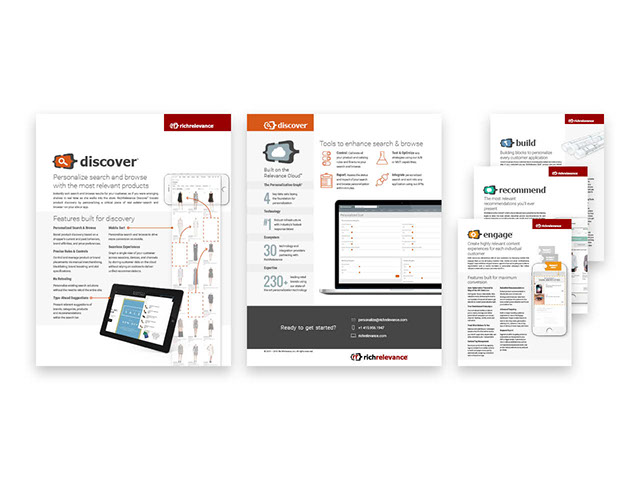
RichRelevance’s primary product collateral was written by the Product Marketing team, then handed over to me for layout. With multiple copy writers, one challenge was making the content consistent across all documents—in structure and voice as well as presentation in general.
The end result was a body of literature that is well-organized and stylistically consistent—both internally as well as externally with the website and other marketing materials.
Most of these were translated into French, German, and Portuguese.
Solution 1-Pagers
Client
RichRelevance > Product Marketing & Sales
Contribution
Template, layout & graphics
Description
RichRelevance’s primary product collateral was written by the Product Marketing team, then handed over to me for layout. With multiple copy writers, one challenge was making the content consistent across all documents—in structure and voice as well as presentation in general.
The end result was a body of literature that is well-organized and stylistically consistent—both internally as well as externally with the website and other marketing materials.
Most of these were translated into French, German, and Portuguese.
<
>


Professional Services Logo
Client
RichRelevance > Product Marketing & Sales
Contribution
Brainstorming & design
Description
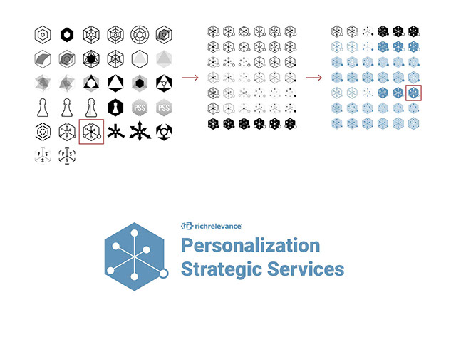
A representative from Client Services approached me at the start of brand new initiative to organize and promote professional services and expertise to clients. In addition to a variety of new graphics and sales materials, the new plan required a logo.
Most of the early concepts keyed off one of the main aspects of the new services, which is a six-pronged system for rating a customer’s “personalization maturity.” The requester agreed that this would be the best direction for the logo, chose his favorite concept, and I iterated from there.
The final logo makes use of the same blue that had been used in the previous incarnation of this team’s branding.
OneWestmont Logo
Client
OneWestmont
Contribution
Brainstorming & design
Description
OneWestmont is the LGBTQA student and alumni support group of Westmont College, primarily operating through Facebook. After the group started getting more media attention in 2012, I decided to craft a logo to help elevate the branding to that of other existing campus groups.
I applied the familiar rainbow motif to original, ribbon-style lettering, emphasizing the interconnectedness of all people.
Real Estate Company Logo
Client
Kaufman Real Estate Group
Contribution
Brainstorming & design
Description
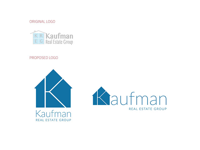
Proposed logo design for a real estate company. While the design was not used, the eventual replacement does bear some resemblance to it.
Solution 1-Pagers
Client
RichRelevance
Contribution
Brainstorming & design
Description
Throughout my tenure, RichRelevance was constantly adding, removing, and redefining its product and solution offerings. While these wide-ranging products did not all exist at the same time (nor is this all of them), they stemmed from the same design schematic I established in early 2009 with the company’s core offerings, based off the original corporate logo.
Admittedly a bit too "Web 2.0," the top three logos had a roughly five-year run before the products were reorganized and rebranded, with the same basic design but with a more modern look/feel.
Relevance 2.0 Kickoff
Client
RichRelevance > Marketing
Contribution
Brainstorming & design
Description
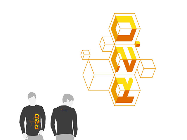
When RichRelevance was gearing up to publicly launch its completely rebranded product suite, it created an internal code word for employee education, comprehension, and hype. That code word was “Relevance 2.0,” and this long-sleeve tee was given to every employee across the globe.
The primary goal here was to create a design that was actually cool and wearable, and not too corporate or dated.
<
>






.jpg?crc=511115326)



Please Please Me
1963
The Beatles crashed onto the world music scene with this release, featuring such hits as "Love Me Do," "I Saw Her Standing There," and the title track.
The original cover photo was taken (rather hastily) at EMI Studios' London headquarters. The Beatles would re-stage this image in 1969 for their planned "Ger Back" album—the final product, Let It Be, reflected the band's desire to return to their more acoustic, low-production rock 'n roll roots.
With the Beatles
1963
The staging of Robert Freeman's iconic photograph was my focus for this interpretation of The Beatles' follow-up release later that year.
Paul McCartney recalls, "He arranged us in a hotel corridor ... a window at the end: it was very un-studio-like."
A Hard Day's Night
1964
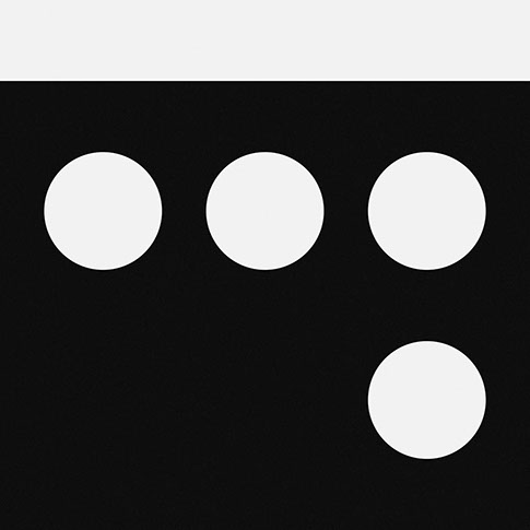
The 5x4 grid layout certainly drove the original design for this seminal album. Removing one of the rows results in an even 4x4 grid that I used to fill the square canvas.
Beatles for Sale
1964
I gave myself a different set of rules depending on the album. As "Beatles for Sale" is arguably the least graphic or iconic of the lot, I allowed myself to play around with a quasi pixel-art composition.
Help!
1965
An early attempt focused on the Fab Four's head coverings from the original album cover, but in the end I decided that the original exclamation mark was all that was needed. Maintaining the exact typographic appearance of the glyph preserves a tremendous amount of personality that I simply couldn't do without.
Rubber Soul
1965
Groovy.
Revolver
1966
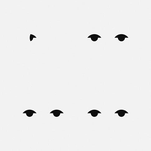
The free-flowing line art and collage comprising this notable cover posed a particular graphical challenge—how to reduce something that is all details.
I chose to focus on what I believe are the focal points of the layout: the piercing eyes of Paul, John, Ringo, and George.
Sgt. Pepper's Lonely Hearts Club Band
1967
I had originally wanted to focus purely on the drum, but that approach led me nowhere. Tying in the bold, neon band uniforms, however, provided just the combination of elements I was looking for.
The background color was sampled from the outfits worn by the Beatles' wax counterparts, demonstrating how drastically their image had evolved in only three short years.
Magical Mystery Tour
1967
John's walrus takes center-stage in Beatles lore as well as the original album design for the band's most psychedelic undertaking. Why not just make him the star of the show?
The Beatles (White Album)
1968
After a string of three incredibly busy cover designs, The Beatles switched gears and opted for a cover that was as minimal as you could get.
What else could I do?
Yellow Submarine
1969
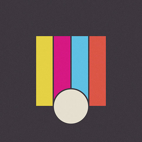
I opted to take a slightly more modern approach for my interpretation of this classic album/soundtrack.
Abbey Road
1969
I knew I had to let that iconic street crossing drive the composition, but it took several iterations before I finally landed on this perspective-free take on the classic cover.
Let It Be
1970
Lastly, here's some more fodder for you "Paul is dead" conspiracists.
<
>